The Jeo Keyboard Layout
Aug 25, 2018 · 7 min read
Jeo is a keyboard layout which is optimised for software development. It looks like this:
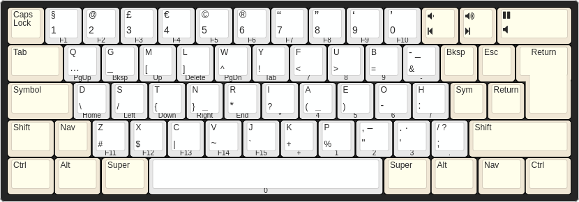
Weird, right? I won’t say it’s the optimal layout, but if you’re sitting on something which offers any significant improvements (and still works on an off-the-shelf USB keyboard) then I’d love to hear about it!
I’ve been using Jeo in production for a little over 3 years now; in a word, it’s been delightful. It took me about 2 days to get to grips with (YMMV, of course), and since then I’ve just been making little tweaks here and there to maximise the awesomeness. I’m pleased to announce1 that there haven’t been any ill-effects; unless you count raised eyebrows, confused coworkers, and an inability to type ‘normally’ in interviews, in which case there have been many ill-effects.2 On the whole, it’s been a blast; I will be sticking with Jeo for the foreseeable future, and I wholeheartedly recommend that you start using it too.
Why?
By virtue of the fact that you’re reading this, I’m going to assume that you’ve already ditched QWERTY and embarked on an alternative layout pilgrimage. Maybe you’re a Dvorak user (cute), or a Colemak fan (respectable, save for the fact that you can’t type ‘The’ without wincing), but either way you understand that there are more important factors in key arrangement than making it so that you can spell ‘typewriter’ using only the top row.
Obviously, claiming that QWERTY is worse for the world than the US remake of Skins would be hollow without some data to back it up. Fortunately, Martin Krzywinski has produced a ‘fully-baked parametric model of typing effort’ that we can rely on. I recommend giving his Carpalx study a read if you have time; here are the headline results if you don’t:

Jeo uses Krzywinski’s QGMLWY letter mask, which is fully optimised for typing in English, and happens to keep some common shortcut keys (ZXCV) in their familiar locations. By switching from QWERTY to Jeo, you cut the work your fingers have to do near enough in half.
But I write software, not novels!
Sure. Optimising the letter mask for natural language is not the same as optimising for variable names and programming language keywords, but I’m willing to bet that you type more words in English (comments, docstrings, Slack messages) than you do in actual code, so QGMLWY is still a good fit.
What you also need are numbers, navigation keys, and – most importantly – symbols. Jeo has you covered here. It provides dedicated symbol and navigation layers that are heavily inspired by Neo, a German programmer layout. Everything you need is available on top of the conventional letter keys, so you never need to move your fingers more than one key from their resting position.
The number row is still there if you really need it, but (if you’re anything like me) you’ll quickly come to realise that it’s a bit of a reach, and difficult to hit accurately. No thanks!
At this point, you may be wondering whether it’s valid to assume that the symbols and the letters should be on separate layers. It’s a very good question; some symbols are used a lot when coding (brackets, commas, semicolons) – possibly more often than the least common letters! In principle, you could mix the letters and symbols into two masks – primary and secondary, say – but it becomes difficult to reason about. Krzywinski makes some interesting observations on this topic.
Original Content
Although most of Jeo is cherry-picked from Carpalx and Neo, it does come with a few tricks of its own. Some of these seem a little peculiar at first sight; they’ve basically developed organically through continued usage.
Backspace, escape and return
These three keys are super important, but on almost every other layout they’re relegated to the far corners of the keyboard. Jeo resolves this issue by bringing them all inside the traditional ISO (L-shaped) return key.
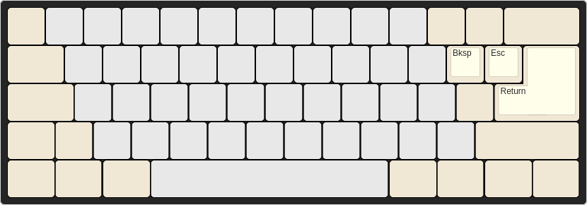
Jeo’s logical Return key is agnostic of whether you’re using an ANSI or an
ISO physical keyboard – effectively, you always have the so-called ‘big-ass
enter’ at your fingertips.
Media keys
You can’t write a test suite without music, and you can’t listen to music without being interrupted. This makes volume and playback controls a staple of any software engineer’s keyboard. Jeo makes them easier to hit than a regular keyboard by putting them to the right of the number row.
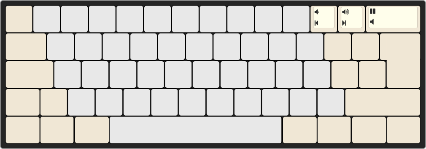
The play/pause button occupies the huge key formally known as backspace, making it an easy target to hit when startled; the volume controls are right next door. Mute, previous and next are accessible through the same keys but on the symbol/navigation layers (either will work – it’s not like you have time to choose when you’ve accidentally started blasting out Union J to the whole office).
Variants
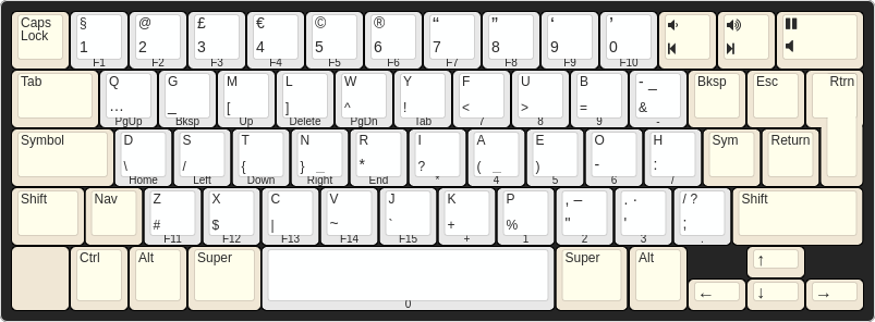
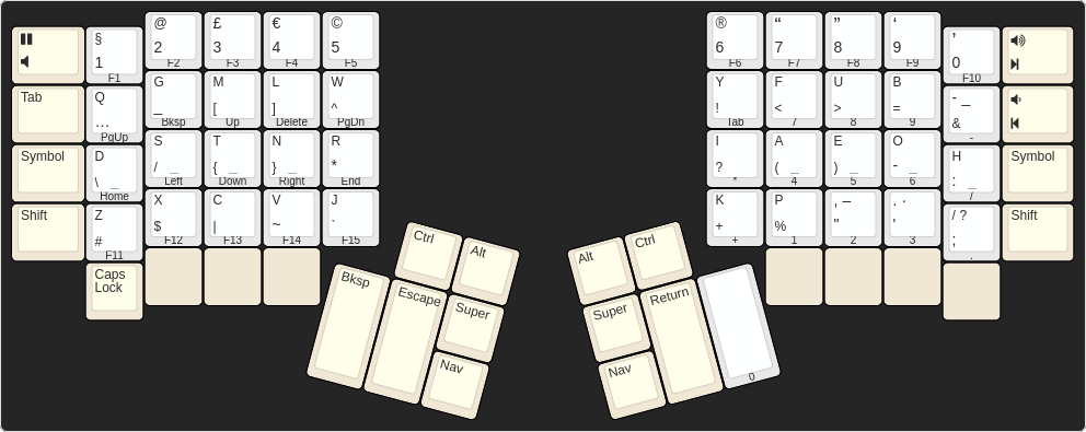
As you may have noticed, the image at the top of this page is of an ISO keyboard. Jeo works with ANSI too (through you may wish to sacrifice your left Alt for the Nav key), and I am sure it can be equally-well adapted to whatever fancy split Topre ortholinear keyboard you have sitting in front of you.3 Here’s a little inspiration:
ANSI desktop
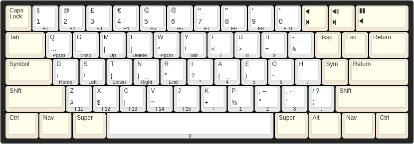
ANSI notebook
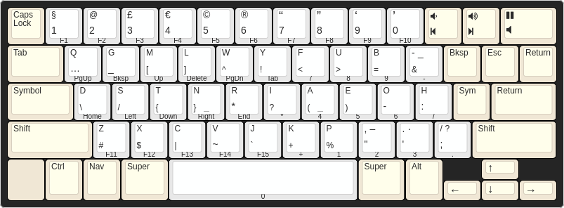
ISO notebook
Kinesis Advantage
Infrequently Asked Questions
How do I start using Jeo?
Check out the README on GitHub.
Why is it called ‘Jeo’?
Jeo’s symbol and navigation layers are inspired by Neo, a layout for German-speaking programmers. Also, ‘Jeo’ is the way I kept mis-spelling an old name while I was starting out with the layout.
Does it work with Vim?
An excellent question. The answer is yes – surprisingly well. J and K are
still next to each other, but now you have one under each index finger, rather
than both sharing the right hand. H and L are ‘the wrong way around’, but this
is something you get used to very quickly; when you do, you’ll realise that
having W and L as neighbours (and likewise for B and H) is pretty neat – you
can easily ‘seek’ left or right, first by word, then by letter. If none of
that floats your boat, though, noremap is just a buffer away…
It goes without saying that having escape moved closer is a godsend, but presumably you already did something about that in your old layout.
How did you draw the fancy geometries?
Using the fantastic keyboard-layout-editor.com. You can check out the sources on GitHub.
What exactly do the legends on the geometries mean?
Oops… you’ve noticed that the markings aren’t exactly consistent. The geometries are intended mainly as a mnemonic; if I drew out the layers precisely, it would all get very cluttered!
Since you’ve asked, there are (broadly speaking) four different types of key:
Modifiers
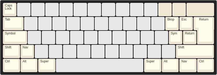
These are marked in yellow; they’re the simplest type of key, only having one action (regardless of which other modifiers are also held down).
Media keys

These are the three keys in the top right which are also marked in yellow.
The upper legend is what you get when you ordinarily press them; the lower
legend is what you get when Symbol or Nav are held down.
Number keys
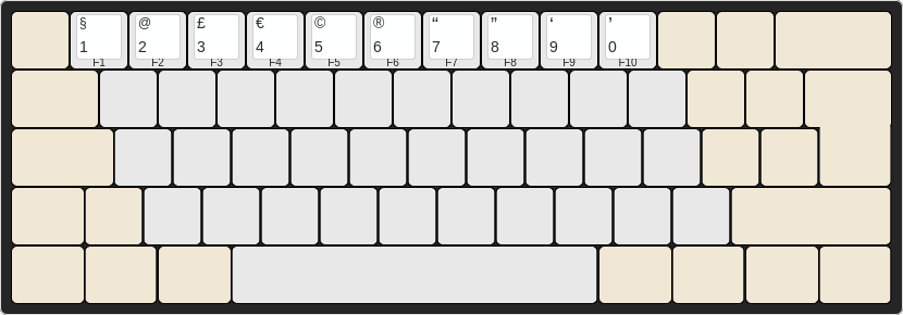
As you might have guessed, this is the top row of keys in white. As you might
also have guessed, the number is what you get when you ordinarily press them.
The upper legend is the symbol that you get while holding down Symbol, and
the front legend is the function key that gets sent when you hold down Nav.
The Shift modifier has no effect on number keys.
Letter keys
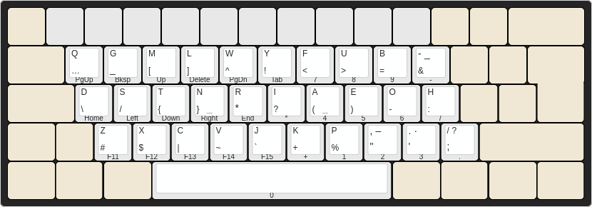
These are the rest of the white keys. You ordinarily get the lower- or
upper-cased letter (top legend), depending on whether Shift is held down.
There are a few ‘letter’ keys which have two punctuation characters as their
upper legend (e.g. /?). The first character is what you get without Shift,
and the second is what you get with Shift.
For all letter keys, the lower legend is what you get with Symbol, and the
front legend is what you get with Nav.